Influenso : Classic Portfolio Website for Influencer Personal Branding
Business Industry
Portfolio
Revenue Increase
$127k
Project Duration
6 Days
🧠 Project Overview
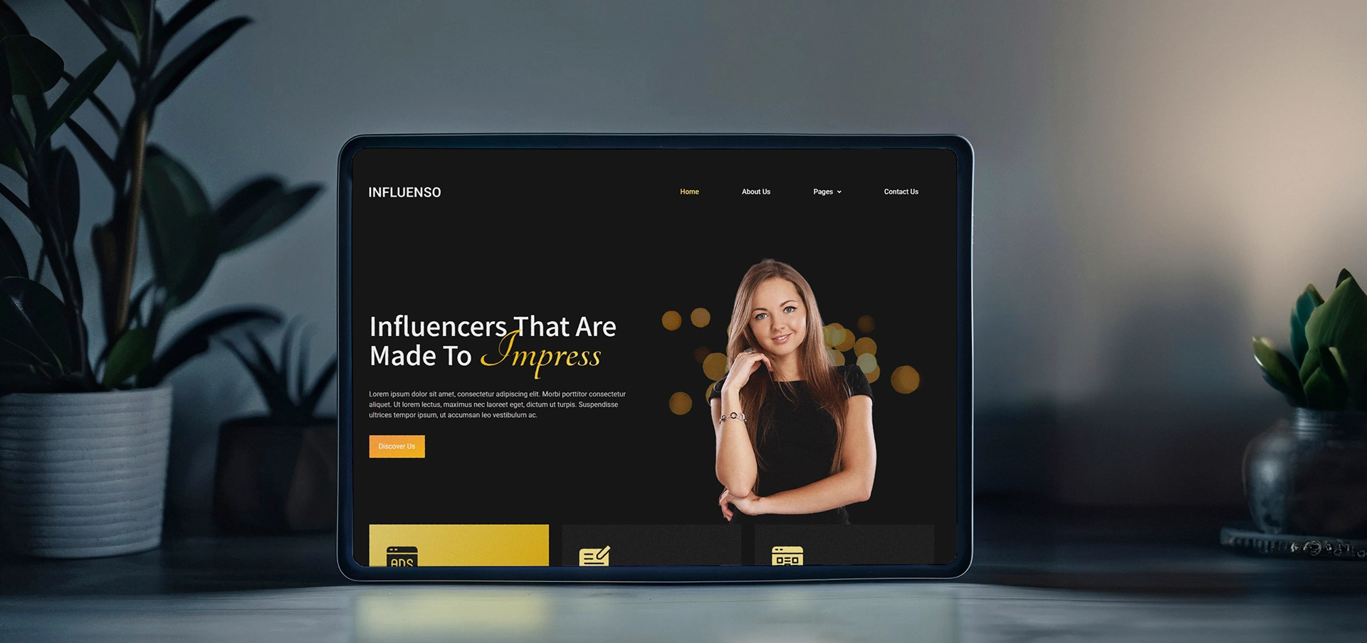
We designed a modern, scroll-friendly portfolio template for influencers who want to showcase their personal brand, social reach, and collaborations in one place. The goal was to build a sleek, mobile-first design that combines strong visual identity with smooth user journeys — all ready to be customized for individual creators.
🎯 Goals & Objectives
Highlight the influencer’s personality and content style
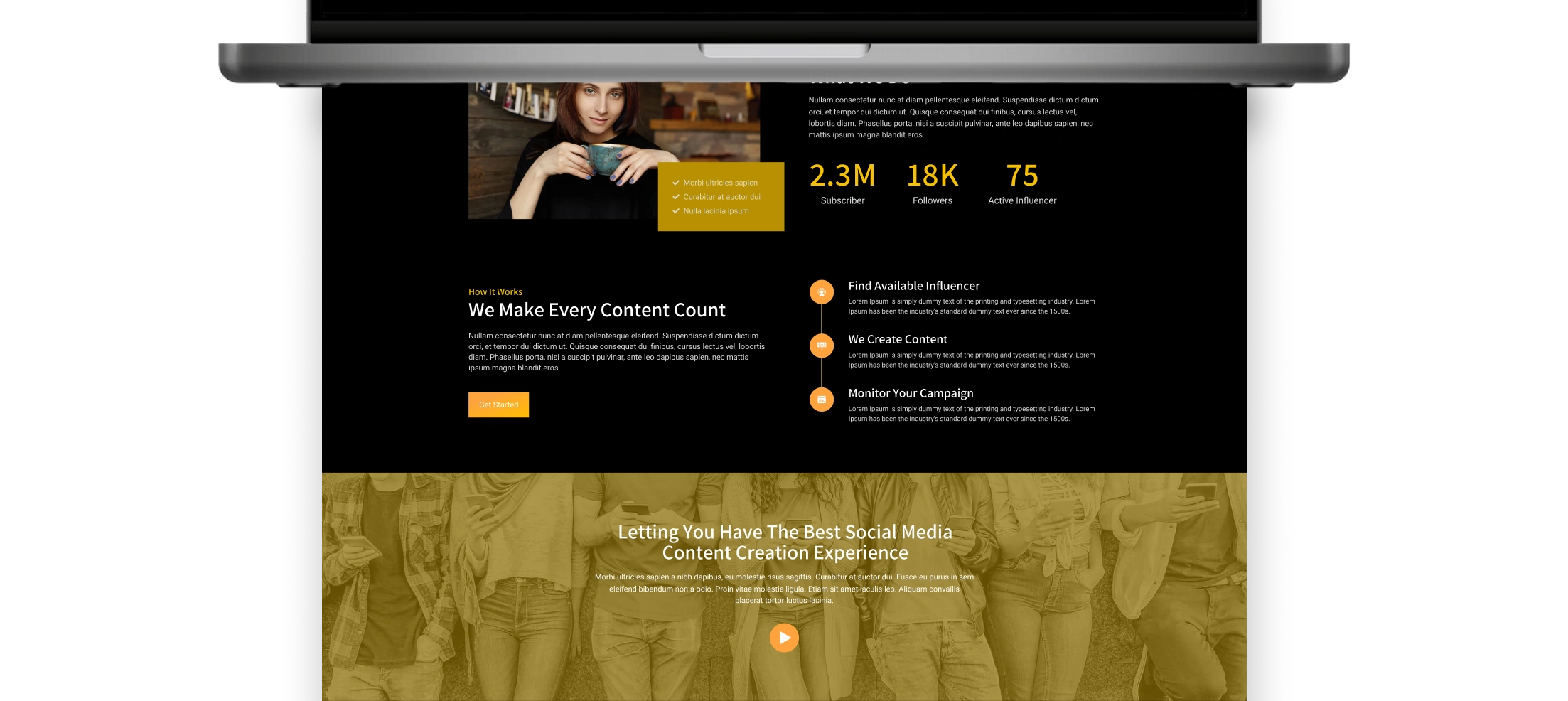
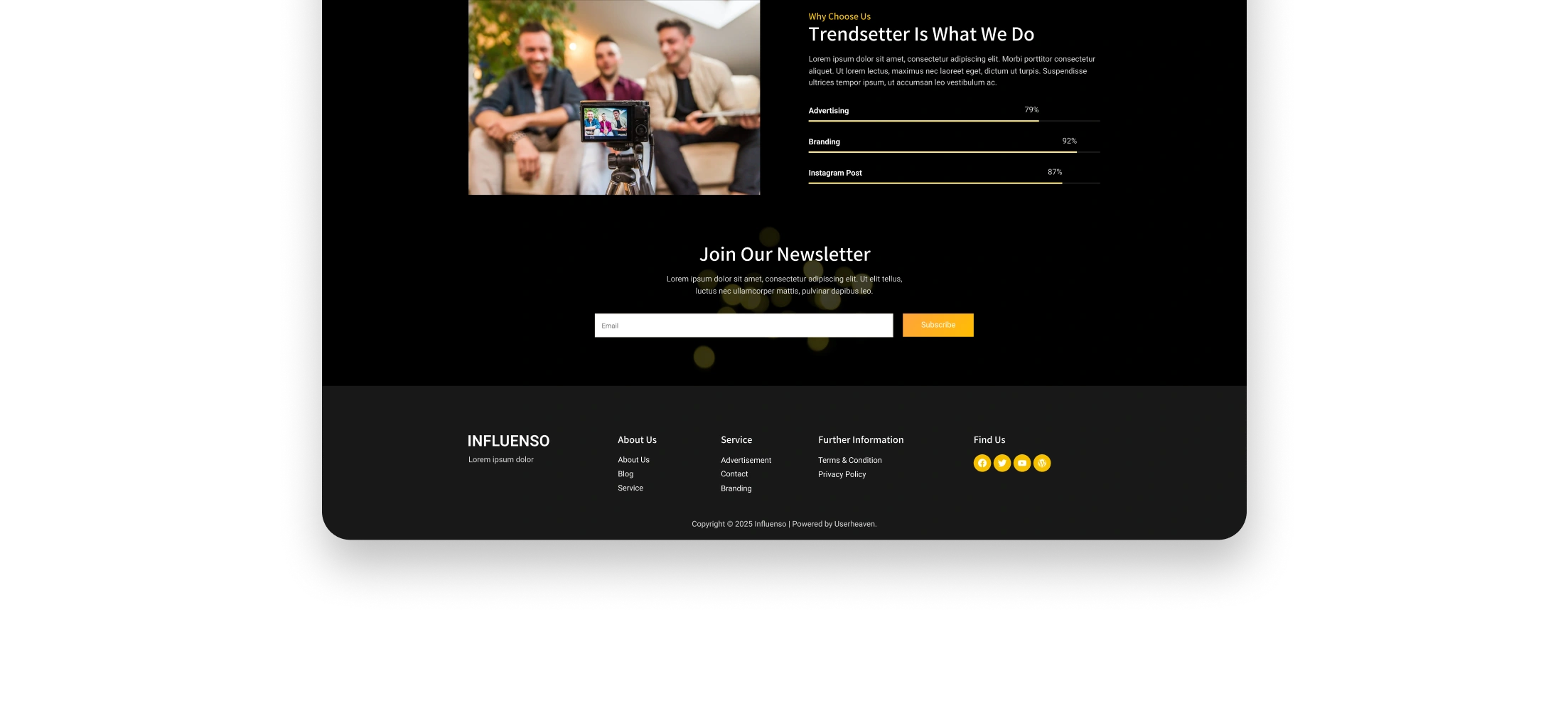
Showcase media kits, social stats, and brand partnerships
Create an engaging, easy-to-navigate user experience
Ensure adaptability for multiple influencer niches: fashion, travel, tech, etc.
🔍 Research & Inspiration
We explored existing influencer websites and popular platforms like Instagram, YouTube, and TikTok to identify trends and pain points. Most personal sites lacked structure or strong CTAs. We drew inspiration from editorial layouts, storytelling techniques, and social card-based content display.
🧩 User Experience Strategy
We mapped out a clear user flow that guides visitors through the influencer’s story — from a strong intro to content previews and collaboration calls-to-action. Attention was given to mobile interaction, visual rhythm, and accessibility. Sticky navigation, quick scroll sections, and a clean hierarchy were key features.
🎨 Style Guide
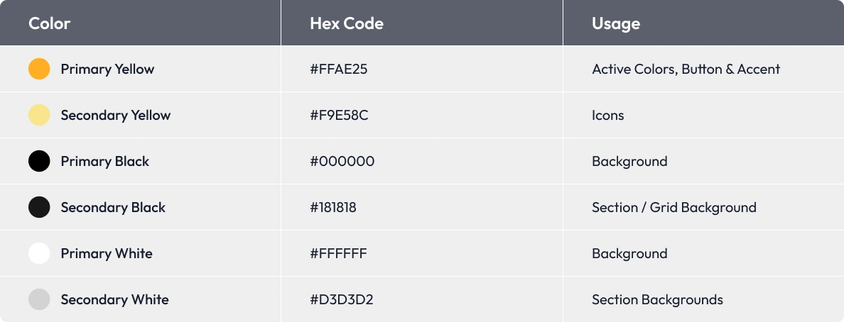
1. Brand Colors
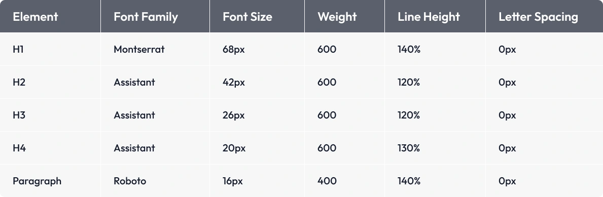
2. Typography
Font Family : Raleway (Regular, Medium, Semibold)
3. Buttons
🎨 UI Design
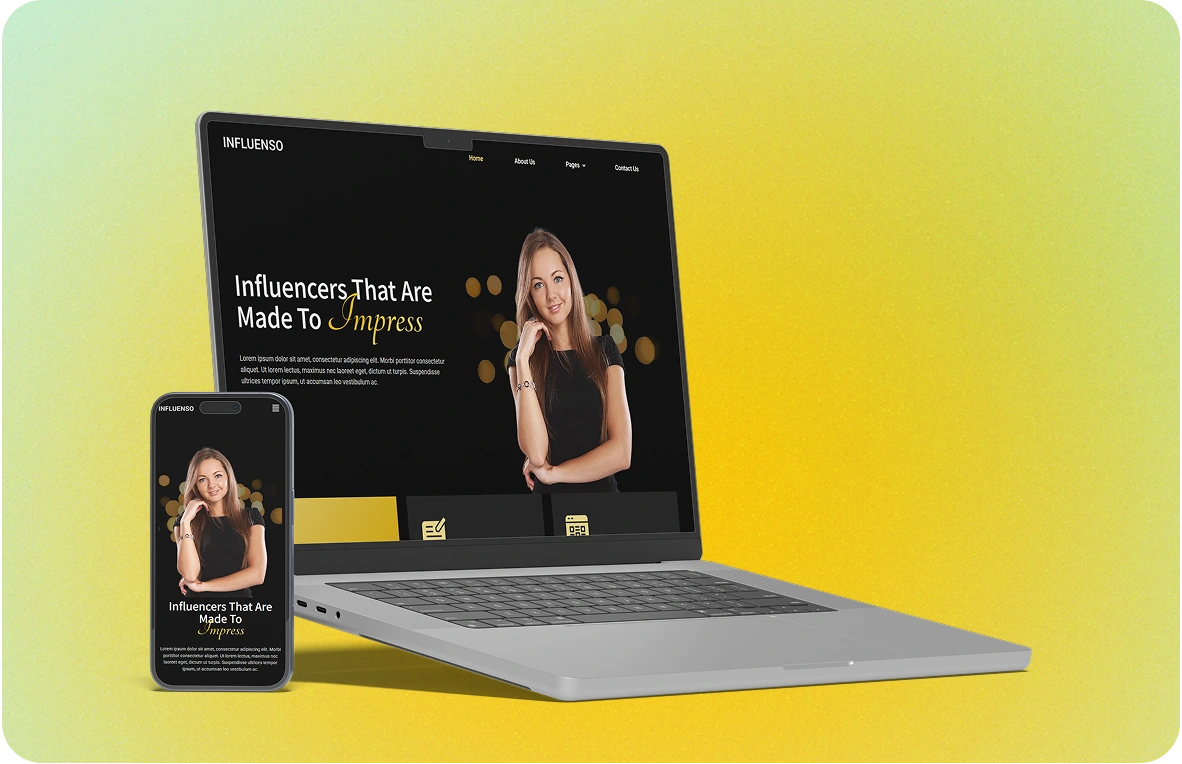
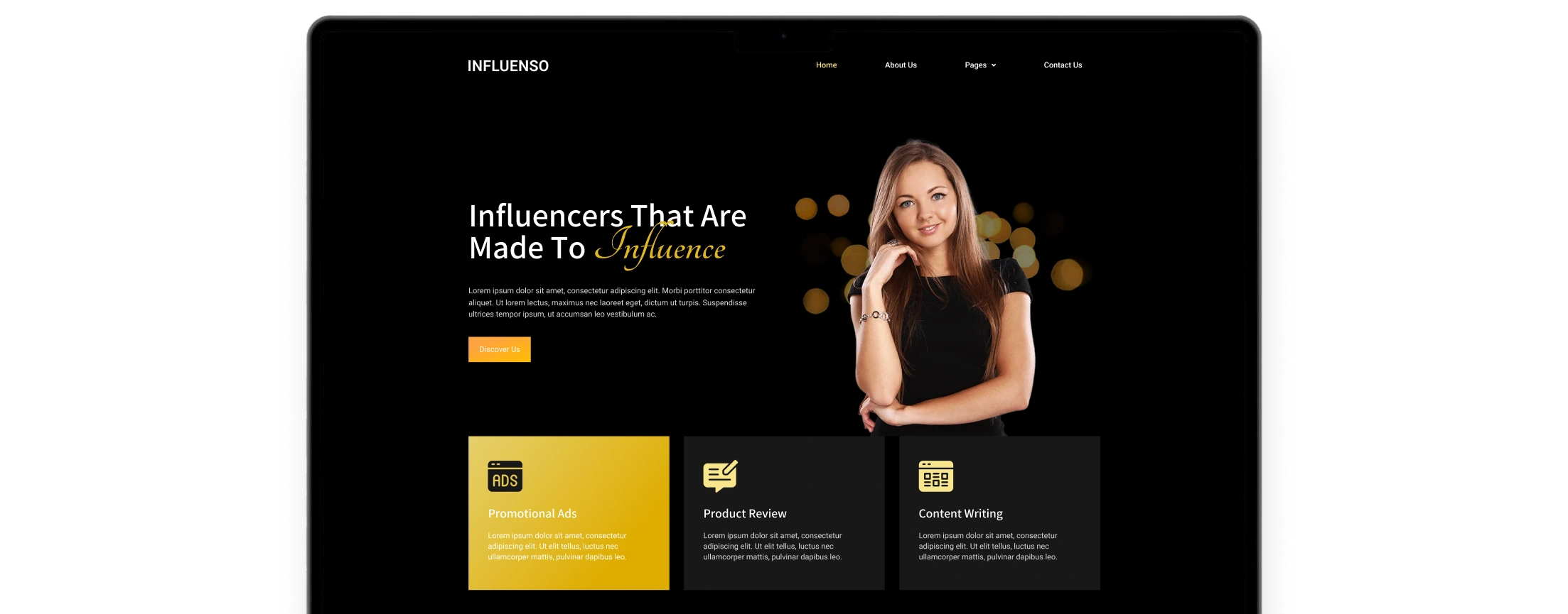
The UI design focuses on visual storytelling, personal branding, and easy content discovery. With a bold hero section, signature typography, and modular layout, the interface highlights the influencer’s personality, recent collaborations, and social media presence. Clean spacing, subtle animations, and an intuitive scroll experience guide visitors through the portfolio — from featured content to partnership inquiries. The color palette and design elements are crafted to feel both modern and adaptable, making the site feel professional yet personal.
🧪 Prototype & Testing
We tested interactive prototypes with a sample group to evaluate usability. Based on feedback, we refined call-to-action clarity, streamlined the onboarding process, and improved responsiveness across devices.
🛠️ Development Collaboration
Once the website’s UI/UX design was finalized in Figma, we prepared a clean and organized development handoff for the WordPress team. This included responsive layouts, reusable components, design tokens, and interactive prototypes that clearly outlined user flows. All assets were exported and named consistently, while typography, spacing, and color systems were documented to ensure pixel-perfect implementation.
The result was a smooth, efficient transition from design to development—reducing guesswork and accelerating build time.